Author: Andy Upton, Art Director
I arrived in Berlin with plenty of recommendations ringing in my ears from friends and colleagues: ‘It’s really arty’, ‘It’s right up your street’ and so on, and they weren’t wrong.
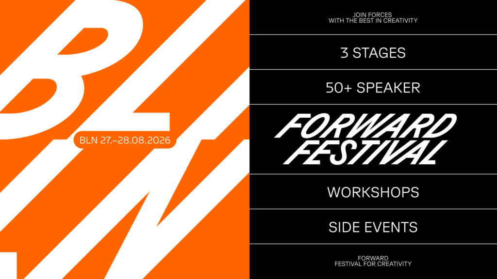
The main reason for the trip was Forward Festival—two packed days of creativity, design and enough inspiration to keep my camera roll busy for quite some time. But if you followed my trip to the Vienna edition a couple of years ago, you’ll know I’m not very good at simply travelling from hotel to conference venue and back again. After all, that was partly the point of coming here.
Before the trip, I wrote about the importance of getting away from the screen every now and then and experiencing creativity out in the real world. Berlin turned out to be a pretty good place to practise what I preach.
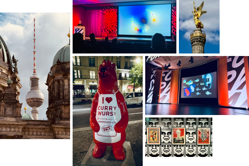
Between conference sessions, I squeezed in as much wandering as possible, taking in the architecture, buildings and street art along the way. It’s a city with an incredible visual energy. There always seemed to be something worth stopping for, looking at and (inevitably) photographing.
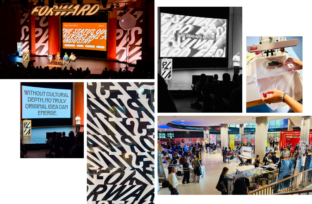
Forward Berlin was on a much bigger scale than the Vienna edition I’d previously experienced. The line-up alone featured more than 50 speakers across three stages, alongside workshops and a packed expo area, which unexpectedly became one of my favourite parts of the whole event.
Artists and independent magazines were selling their work alongside product demonstrations, but more importantly, there were opportunities to actually make things. Screen printing, sticker making, risograph collaging and tufting. Rather than simply walking around looking at other people’s work, you could get involved, have a go and probably come away with something you hadn’t planned on making.
Looking back, that hands-on side of the festival feels quite important. It created a space where people weren’t simply consuming creativity. They were making, talking, sharing, learning alongside one another, and connecting—which was a refrain that continued to repeat.
With so many speakers and three stages running across the two days, deciding who to see became something of an art form in itself.
Day one jumped between all kinds of creative disciplines, from code-based visual expression to creative journalism, but one idea stayed with me in particular: our analogue and digital worlds don’t have to sit in opposition.
The talk from Supersense captured that brilliantly, exploring work that combines the two and touching on the renewed appetite for formats such as Polaroid photography and vinyl records.
It was a nice reminder that adopting new technology doesn’t necessarily mean abandoning what came before. The interesting bit often happens when you find new ways of putting the two together. Which brings me to day two.
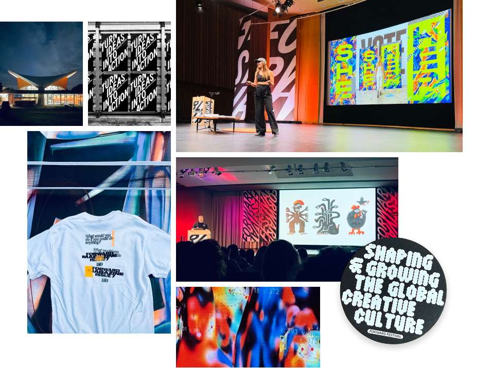
Day two somehow managed to dial the energy up again. It started, for me at least, with another visit to the printing area. This time I actually managed to get my hands on a blank T-shirt and make something of my own.
Then it was back into the talks.
Future Deluxe, Gemma O’Brien and Greek design studio Beetroot were particular standouts for me, each with beautiful work but very different creative journeys.
Beetroot’s talk especially stuck with me. Their work showed how creativity can be rooted in the culture and heritage immediately around us, rather than always looking elsewhere for inspiration. Just as interesting was the way they talked about their own studio as something that could connect with the community around it, incorporating a café, shop and event space rather than simply being somewhere people disappeared into to work.
Suddenly, a theme that had been bubbling away across the two days became much clearer.
Before arriving in Berlin, I’d half-expected an AI onslaught. And it would have been understandable. We’re living through a period when seemingly every conversation about creativity eventually finds its way to AI, emerging technology and what either might mean for the future of our industry.
But the thing I found most interesting about Forward Festival was almost the opposite. Again and again, the conversations seemed to come back to people: making things together, learning from one another, connecting with our local communities, rediscovering physical processes and using our creativity to contribute to something beyond ourselves.
That doesn’t mean rejecting AI or the digital world. Far from it. One of my biggest takeaways from the first day was precisely how exciting digital and analogue can be when they work together.
But perhaps as technology becomes more capable, the human side of creativity becomes more important, not less. Two days at a design festival reminded me that creativity is still, fundamentally, a very human thing. Maybe I shouldn’t have been quite so surprised by that.
I went to Berlin looking for inspiration. I found plenty of it in the work, the city, the talks and the things people were making. But the bit I’ve come home thinking about most is the people themselves, and what can happen when we make the effort to get out there, share ideas and make things together.
Turns out you can’t bookmark that.
Berlin and Forward Festival, you did not disappoint.
Author: Andy Upton, Art Director
One of my favourite parts of being an Art Director is the hunt for inspiration. Honestly, I’m something of a hoarder: pins, bookmarks, likes, the works. I even put out an internal monthly newsletter just to give all that collecting some purpose, and to justify the habit.
But collecting from behind a screen only gets you so far. I’m a firm believer that creatives need to get out into the world and see design in the flesh, and not just design, but art, architecture, sounds, smells, the full sensory brief. Our digital lives give us plenty, but nothing quite replaces standing in a new city, letting a different culture rearrange your perspective a little.
Which is exactly what I’ll be doing later this week: heading to Forward Festival, this time in Berlin, for my first proper look at the city. I caught the Vienna edition a couple of years back and came away buzzing with ideas, so I’m hoping Berlin delivers a similar hit of fresh thinking from designers and artists from around the globe. New city, familiar festival, and hopefully a decent excuse to see more of it than the venue and the nearest coffee shop.
So watch this space, or better yet, the Outlook socials, for daily dispatches straight from Berlin, followed by a full wrap-up once I’m back (Currywurst reviews included).
Go get out there.
A presentation coach I once spoke to told me about two clients he saw in the same week. One arrived having memorised a 16-minute speech and the other came in with a handful of clear points and the confidence to speak around them.
By the end of the session, there was a clear difference. One was focused on getting through it. The other was focused on the room (and the people that matter). Can you guess which was which?
Of course you can.
That’s exactly the difference most PowerPoints miss. They’re built to support the speaker, not the audience.
By the time a deck lands on your desk to “tidy up”, it’s already been built the same way. It’s never that the slides look bad, it’s that the deck is trying to do six jobs at once—inform, reassure, document, prompt, cover the speaker’s nerves and survive multiple rounds of feedback—and somewhere along the way it stopped being a presentation.
Earlier in my career as an events designer, I was the guy on site the night before, working alongside clients and speakers that knew something wasn’t right but couldn’t name it. In those situations you learn fast that what’s needed isn’t a tidy-up. It’s a rethink.
The slides are doing the speaker’s job
Most speakers use PowerPoint as a safety net, which is understandable. Nobody (and I mean nobody) wants to forget a key point in front of senior stakeholders. But once that happens, the slides become the script. Every reassurance the speaker needs is now sitting on screen in nine-point font, asking the audience to squint and listen at the same time.
As a marcomms professional, you’re being given a deck built for one person’s confidence and being asked to make it work for a whole room. Usually without enough time, alongside everything else. The deck is one job among twenty, and it’s the one that’s most visible if it goes wrong.
So the task is to work out what belongs on the slides and what belongs in the speaker’s mouth.
Words do more work than slides
It’s easy to assume good presentation design is about making slides look pretty. It isn’t.
Copy carries more weight than it gets credit for—as our creative copywriter and proofreader reviewing this article will no doubt agree (hi Becky and Josie). The strongest decks have clear, purposeful statements running through them. Not headings that label a topic, but lines that tell the audience the point straight away. A strong opening statement can frame a slide in seconds, which means people aren’t picking through the detail trying to work out what matters.
That’s where the real improvements start. Not making everything shorter for the sake of it, but being more deliberate. Say the right thing clearly and give the audience a way in.
The same goes for imagery. Used well, it sharpens a message or sets the pace. Used badly, it becomes filler.
Complex doesn’t have to mean cluttered
You’ll get pushback on this, especially in regulated sectors—”it needs to all be there”. And often, it does.
A lot of the decks crossing your desk are complex for good reason: real data, detailed graphs and technical nuance that really matters. In healthcare, medtech and similar spaces, that detail is often the point.
The work is in how you shape it:
That’s a better conversation to have with stakeholders than “we need to make it look better”. It’s also often easier and more cost-effective. Win-win.
The decks that work are collaborative
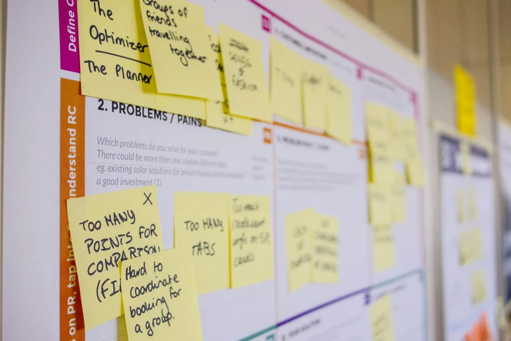
The presentations that get it right are almost always the ones built together. Not the ones tidied up at the last minute, but the ones where there’s space for a real conversation.
If you’re the person managing this from the comms side, that conversation is yours to push for. The speakers who lean into it get more out of the process. And so do their audiences.
Once that’s sorted, designers can work their magic and creatives can carve the copy so the deck comes to life and nothing gets missed.
With that in place, the audience will remember what you said.
Which is the whole point of doing this in the first place.
Reading this and thinking “I need someone who can actually do all of this”? Good news, you’ve found them. Get in touch.
For twenty years, a global medtech leader has trusted us with their highest-profile events.
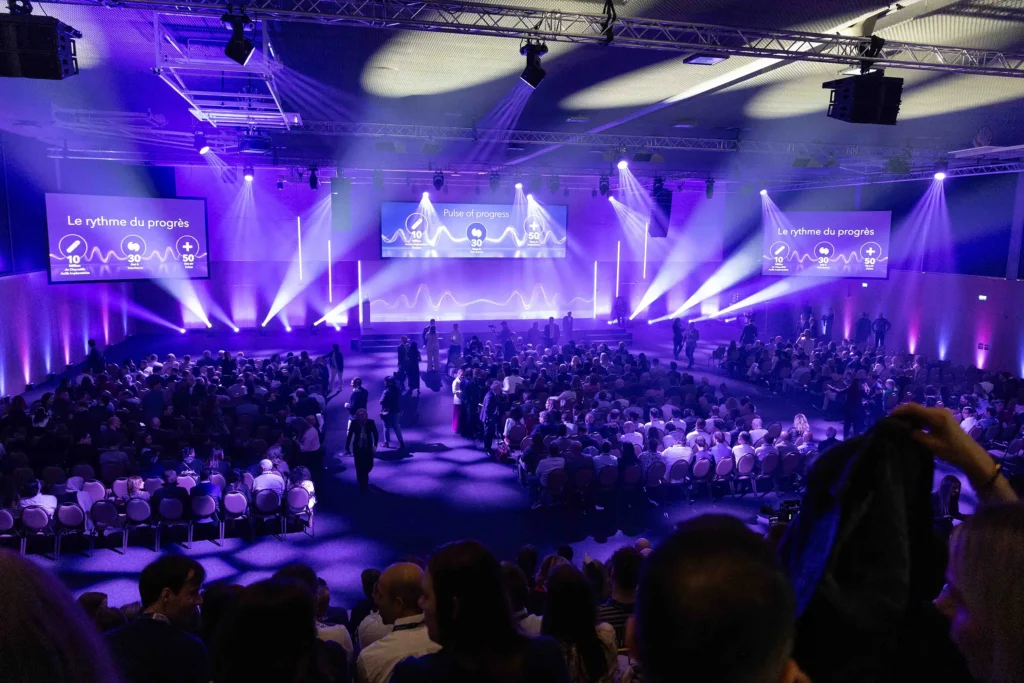
So when they approached us to help launch their 2026 milestone celebrations, we knew that it would be a standout project. The year marks three major milestones, each representing decades of innovation, growth and impact in healthcare:
To bring those moments together, we looked to create an identity for a two-day celebration involving more than 800 employees alongside senior and executive leadership. The original brief sounded simple: one visual for one event. But as we explored the project, it became clear that this was something far bigger. A milestone year that demanded an identity capable of carrying the story.
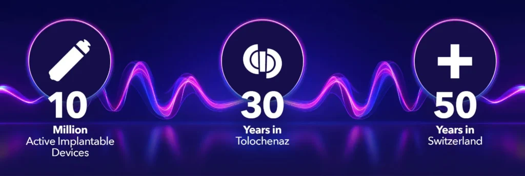
Finding the pulse
These anniversaries were about more than numbers. They needed to resonate with the people behind them. They were a powerful reminder that lives have been changed and clinicians and caregivers have been supported, all made possible by their employees’ hard work and innovation to shape the future of healthcare.
So with the stakes this high, the creative process had to start with the right question: what does this moment actually represent?
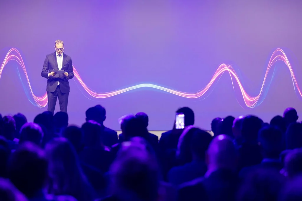
We came up with the idea: the Pulse of Progress.
A pulse is a simple but powerful signal of life, capturing movement and momentum. And progress, whether in healthcare, technology or patient outcomes, is rarely linear. The concept felt right immediately.
Collaborative creative
To bring it to life visually, the team developed a distinctive ‘wave’ identity. This took the form of a rhythmic pulse that could move across various formats, screens and spaces. This visual language that felt both dynamic and meaningful, as well as connected the client’s role at the heart of healthcare.
Projects like this only work when different disciplines work in harmony: creative direction, art direction, design, copywriting and moving image all came together holistically, ensuring every piece of the campaign told the same story.
Bringing the story to life
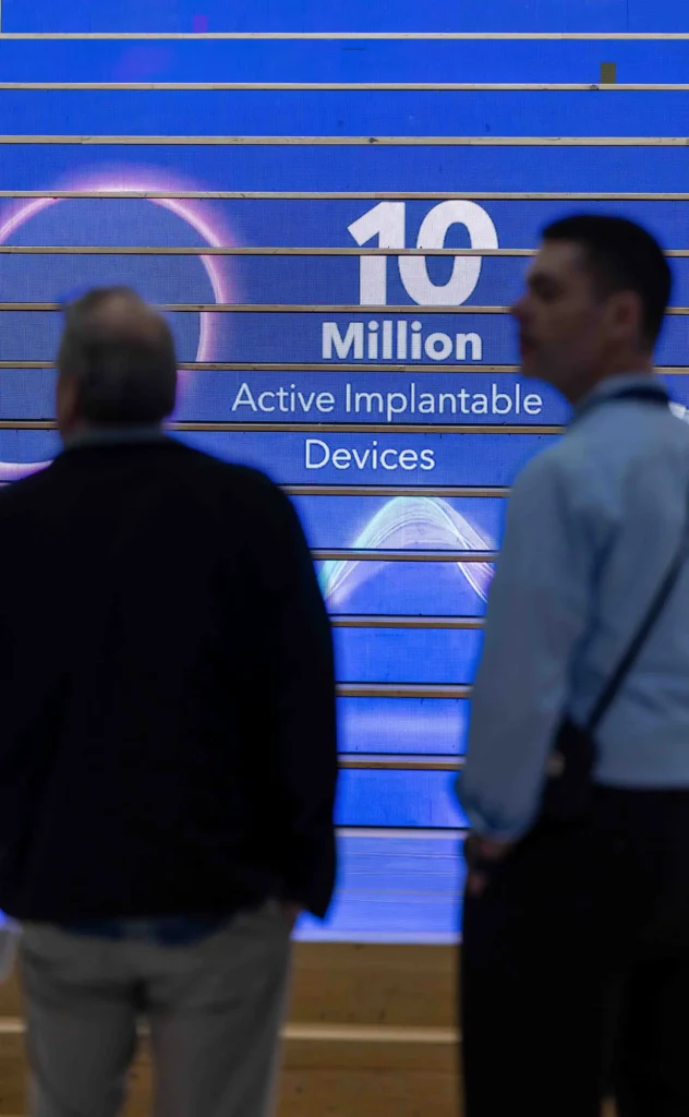
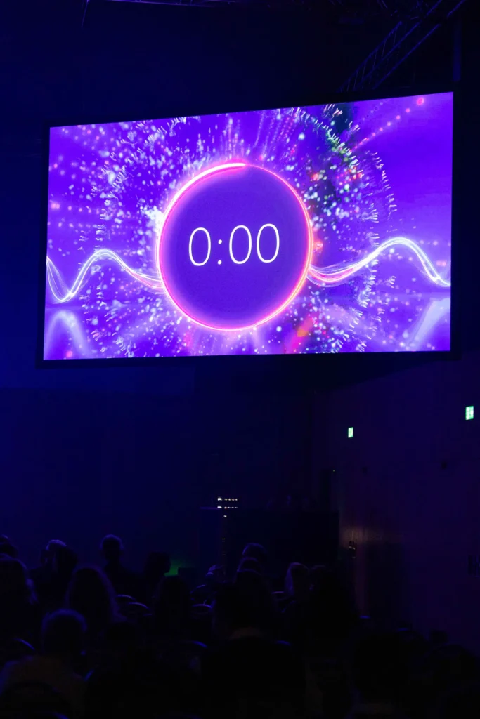
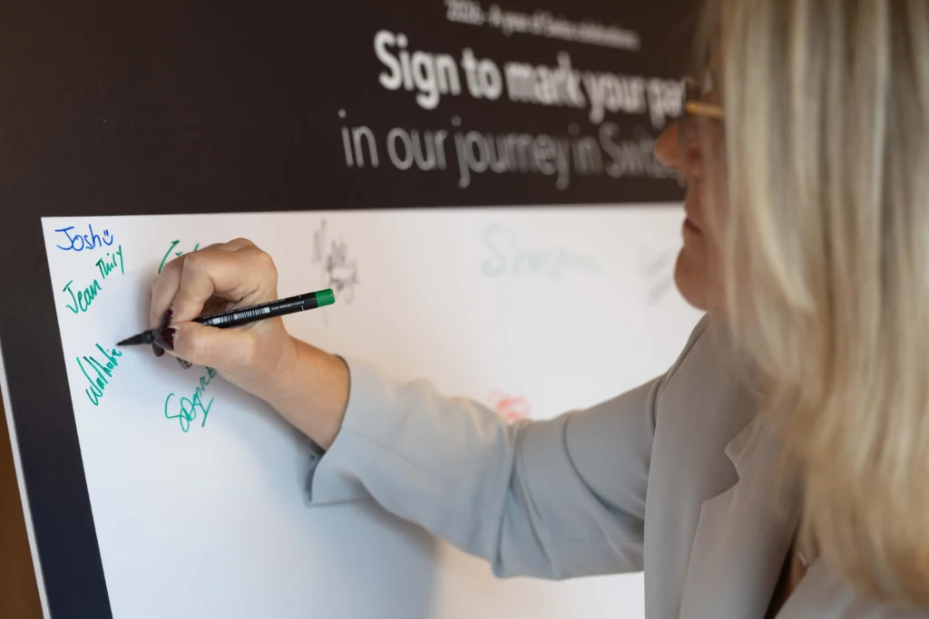
Once the identity was established, the campaign quickly expanded across multiple formats. The team designed and produced a wide range of materials, including presentations, event branding, environmental graphics and video content.
In the weeks leading up to the celebrations, our video team spent multiple filming days capturing additional content to support the narrative. One of the most powerful moments came in Bern, where our crew documented the implantation of a landmark implantable device at one of the country’s leading hospitals. A milestone that brought the scale of the achievement into sharp focus.
The two-day event itself marked just the beginning. Even weeks after the launch, internal teams continued to reference the work, and external audiences noticed its reach. Short-form social edits, long-form storytelling and internal communications all carried the Pulse of Progress identity forward. With more than 100 creative assets produced, including over 25 video outputs spanning internal and external channels, the campaign wasn’t just visually consistent, but genuinely connecting with people in a meaningful way.
“From concept to execution, the team delivered an identity that was as meaningful as it was scalable. Pulse of Progress united multiple milestones under a single, powerful story, carrying our message seamlessly across events, content and channels. It didn’t just celebrate our history; it brought our people together, reinforced the real impact our work has on lives, and became a shared language for what we’ve achieved and where we’re going.”
– Sr. Director, International Brand, Digital & Corporate Marketing
A partnership built over time
There’s another reason this project feels particularly special for us. 2026 also marks 20 years of collaboration between Outlook Creative and our client.
As our Co-Managing Director, John Lloyd puts it:
‘In the 12 and a half years I’ve personally worked with this client, we’ve delivered thousands of projects together. But this one stands out as one of the highest-profile pieces of work we’ve ever done. The level of content and engagement that came out of this project was incredible.’
Moments like this, where creativity, trust and shared purpose all come together, remind us why long-term partnerships matter. There’s real value in working with people who understand the story you’re trying to tell. And for this incredible milestone year, that story is only just getting started.
Every piece of work has a story behind it. Not just what was made, but how and why it came to be. So we asked our Creative Director, Pete Michels, to share a different kind of perspective—one that steps back from the finished work and into the thinking behind it, offering an insightful glimpse behind the curtain of creativity.
Recently we tried something a little different.
Nothing revolutionary—pretty simple actually. But after going through it, I don’t think we can live without it.
Creative work has a beautifully strange rhythm. You spend an inconsistent amount of time thinking about something. Exploring it. Questioning it. Pushing it forward. Questioning it again.
Then eventually you commit.
And eventually you let it go.
One day it’s ‘finished’. The files are sent. The project moves on. And the work begins to take on a life of its own.
(They grow up so fast.)
And like most things we release into the world, we rarely sit down with it again.
Most designers don’t get the chance to stop and talk about the work once it’s done. Of course there are conversations during the process. Rationales. Check-ins. Presentations.
But that’s still the process.
What’s often missing is the story after the work has been set free.
The hesitations.
The instincts.
The micro-decisions that quietly changed everything.
So, we asked the designers to bring the work back.
Client work. Personal work. The things they’re proud of. Sometimes the things they’re still figuring out.
And then we sit down and talk. Just three of us.
Over the past few weeks each designer has been sitting down with Andy, our therapeutically calm Art Director, and myself (nothing therapeutic about me) to share what we’ve been calling a ‘personal lookbook’.
It’s not a presentation.
It’s not a critique session.
When it works well, it’s closer to a one-sided conversation.
This is their time to talk about the work. We mostly listen. Occasionally scribble something down. Andy radiates a calming presence.
Creative wellness at its finest.
Designers bring together projects and personal work they’re proud of, and sometimes work they’re still processing.
And they talk.
The thinking behind it.
The decisions that shaped it.
The instincts that pushed it one direction instead of another.
They’re using a muscle that, for many designers, doesn’t get exercised often enough.
The muscle of explaining how their creative mind actually works.
These sessions are intentionally small. Just three people in the room.
That intimacy matters.
Sometimes the conversations get unexpectedly personal.
Because creativity, whether we admit it or not, is something we all take a little personally.
Finished design can feel inevitable.
Once something exists in the world, it looks like it was always meant to be that way.
But anyone who has made something knows the truth is usually much messier.
There are moments of uncertainty.
Ideas that almost worked.
Decisions made on instinct, skill, taste and confidence.
Details that need unpacking. Debate. Occasionally, a high-five.
The lookbook sessions open the doors on all of this.
And what emerges isn’t just a collection of projects.
It’s something much more interesting.
A map of how a creative brain works.
Something interesting happens when designers talk about their work like this.
They start by sharing what they’re proud of. The projects that meant something to them. The ideas that pushed a little further. The details that quietly hold everything together.
And often it’s not the projects you’d expect.
But as the conversation unfolds, something shifts.
Not toward critique. Toward understanding.
Why this idea felt right.
Why that decision mattered.
Why certain instincts led the work in a particular direction.
What emerges isn’t a defence of the work.
It’s clarity.
Because real creative confidence doesn’t come from believing you’re always right.
It comes from understanding why you made the decisions you did, and being able to stand behind them.
Here’s the part we didn’t fully anticipate.
Andy and I learn just as much in these sessions as the designers do.
Sometimes we discover strengths we hadn’t fully seen yet.
An interest we haven’t tapped into.
An instinct that deserves more room.
A perspective we should be leaning into far more often.
You start to realise that reviewing the work isn’t really the point.
Understanding the person behind the work is.
These conversations help us see not just what someone has made, but the kind of designer they’re becoming.
Design, after all, is a profession built on judgement.
And judgement only develops through experience, reflection and conversation.
(take a few of them, actually)
In an industry that moves quickly, taking time to step back and talk about the work can feel almost radical.
There’s always another brief.
Another deadline.
Another project waiting to begin.
But pausing to reflect, even briefly, reminds us that creative growth doesn’t just happen through making more work.
Sometimes it happens through understanding the work we’ve already made.
Because the fastest way to grow as a designer is to understand how you already think.
And occasionally, through laughing at the decisions we thought were brilliant at the time.
Great studios talk about the work.
Great designers talk about why the work exists at all.
The lookbook sessions are quiet conversations.
No presentations.
No audience.
No performance.
Just designers reflecting on the work that matters to them, and the thinking behind it.
And in those conversations, something important becomes visible.
Not just what someone has made.
But the designer they’re becoming.
And, hopefully, the studio we’re becoming together.
When an Executive Leadership team event stretches across three days, dozens of sessions and hundreds of touchpoints, the challenge isn’t necessarily volume. It’s coherence. You need everything to belong in the same world, especially when timelines are tight, expectations are high and most of the audience were there last year.
From the outside, this kind of project can look effortless: cinematic, confident and clean. Up close, however, it’s layered and deeply human. Which basically means a small group of very skilled people holding a lot of moving parts at once.
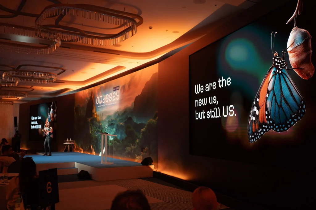
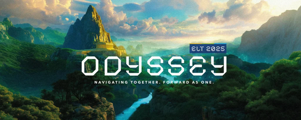
We saw this first-hand on a recent Odyssey-themed Executive Leadership event for a long-standing client of ours. This time, that coherence came from two inseparable forces: a strong, enabling theme, and the way we used AI to expand creative exploration and build at scale.
Granted, AI didn’t make Odyssey happen overnight, but it helped us explore faster, go further and keep the whole three-day experience feeling like one joined-up world.
Turning scale into story
The brief was to deliver a consistent experience across three days that felt intentional, connected and genuinely different for a returning audience. Less your typical conference, more stepping into another world.
Sure enough, world building emerged as a defining idea. Design soon moved beyond individual assets and began to imagine a complete, coherent world that unfolded over the three days. AI stepped up as a creative tool to support that narrative and scale.
That concept then evolved into a journey, or Odyssey, spanning three distinct environments. Early visual thinking drew loosely from fantasy world maps (think Lord of the Rings), where colour, terrain and geography signal progression. It established spatial storytelling from the start and clarified the three stages, helping the audience instinctively understand where they were in the story without over-explaining.

AI as a sketchbook, craft as the finish
When it came to mapping the narrative and distinct environments for each day, generative image exploration became our sketchbook. What started as vast landscapes, dramatic light and architecture emerging from rock progressed into a metaphorical acropolis for day one, dense green mountains for day two and an open water horizon for day three.
This is the bit that can sound magical when you summarise it. In reality, it’s iterative. You explore, refine, test… and then go again. Small prompts don’t always translate to small changes, so creative judgement is a must every step of the way.
Once we had strong direction, we shifted from exploration to build. That meant retouching, rebuilding, extending canvases, correcting light and adjusting perspective, sometimes merging multiple outputs to achieve a workable result. This is the unseen part that requires making the right call: do we regenerate or rebuild? Does that particular imperfection add character, or break the illusion?
An early stylistic decision shaped everything. Rather than aiming for photorealism, we leaned into a stylised, gamified aesthetic, closer to Avatar or a high-end video game world. That choice freed us from being hyper-real and made every design element feel intentional.

Continuity is where it counts
For Odyssey to feel truly immersive, each of our environments had to feel distinct yet undeniably part of the same universe. Otherwise, you don’t have a world; you have three separate backdrops.
The navigators were central to that consistency. As guides through the journey, they had to feel like they belonged inside it. Built as hybrids, we used real client imagery to anchor each character, while generative visuals pushed the world and wardrobe. Here, AI captured the Jumanji-esque vibe we were going for… just not the person. Turns out, ‘generic adventurer’ is easy; ‘recognisable speaker’ less so. Human design skills were very much key to rebuilding and refining each profile until the team was unmistakably themselves.
While AI supported scripting and visuals, the voiceover was intentionally human. A trusted voice actor anchored the story inside those otherworldly environments. Music was selected early with different tracks for each day, so the voiceover was recorded to music. That meant pacing and emotional rhythm were locked in from the outset.
Essentially, the tools helped us explore a bigger playground. The craft is what allowed us to piece it all together into a story with staying power.
So… does AI make it quicker and cheaper?
Onto the golden question: if you’re using AI, doesn’t that automatically mean faster and cheaper? Well, not necessarily.
On Odyssey, it became clear early on that AI wouldn’t reduce the work, but it could raise the ceiling of possibility. The real difference was how much we could build within the time we had, and how quickly we could test ambitious ideas before committing to a final route.
And that’s not to say that the process was seamless. Like any large-scale event, the journey to fruition was still intensive and iterative, with a constant need for creative judgement and control.
That’s the big win with AI. Not speed for its own sake, but what it unlocks: ideas you wouldn’t reach as quickly otherwise, and a broader creative horizon to explore. The output still depends on those talented humans you’ve always trusted making the calls.
If you’re looking for the people who can shape the work, keep it coherent at scale and bring the best ideas to life, let’s talk.
Early January always has the same energy. New plans. New priorities. New pressure to ‘get everyone aligned’. And for a lot of marketing and comms leads, that last bit is the hardest part.
Because change isn’t the problem. Confusion is.
A restructure, a new strategy, a product shift, a refreshed brand, a different way of working. On paper, it’s clear. In real life, it lands in busy inboxes, half-listened-to town halls and Teams calls where everyone’s still thinking about their next meeting. The message gets diluted, people fill in the gaps themselves and momentum slips.
That’s where we come in.
We’re a creative agency, yes. But our job isn’t ‘pretty pictures’ or a nicer set. It’s taking a communication need and turning it into something people actually understand, feel and act on. We join the dots from the first conversation to the final output, so the message stays intact wherever it shows up. That can mean strategy and messaging first, then the right mix of Design, Digital, Film or Live moments, all delivered as one connected story.
The trick is to start with the outcome, then choose the deliverables that make it real.
When a client says, ‘We need an event’, they rarely mean an event. They often mean they need leaders to believe in this change. Or teams to stop interpreting the strategy in ten different ways. Or customers to see us differently now.
So we turn that into reality.
We find the theme that holds everything together (not a list of topics). We break content into segments people can absorb, not monologues they sit through. We design with real cognitive limits in mind, because nobody retains a sixty-slide download. And we make it socially digestible so the story travels beyond the room—because we engage, rather than present.
A recent example: a major global healthcare client brought us in to help communicate a significant shift to their senior leaders. The ask wasn’t ‘make it look good’. It was ‘make this make sense’. We created a shared narrative and built the full experience around it, from the visual identity and films to staging, presentation storytelling and on-the-ground delivery. The goal was simple: replace uncertainty with clarity and confidence.
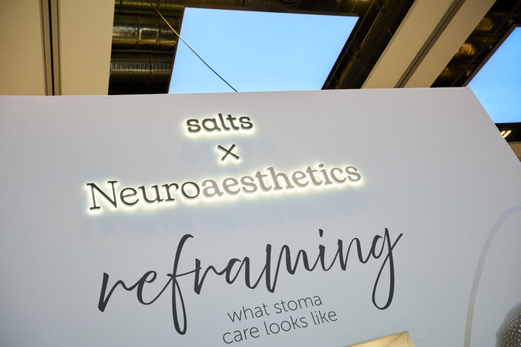
Then there’s Salts Healthcare. We built an exhibition stand designed to communicate their ethos around stoma care in a way that felt human, modern and very un-clinical. Neuroaesthetics. Sensory cues. A deliberately different look and feel. Because the message wasn’t ‘here’s our product range’. It was ‘here’s how we see people, and how we show up for them’.
If your 2026 involves change—which let’s be honest, it will—your comms can’t afford to be generic. They need to land. Transforming Creative into Reality starts with knowing the shift you need from your audience, not what needs to be made.
We won’t name names, but a trusted colleague of ours once said, “Success lies in making the complex seem effortless.” Stick it on a plaque.
For us, that idea of making the complicated look easy is more than an aspiration; we treat it as a commitment. It’s something that drives every project we turn our hand to, especially when it comes to events.
Whether it’s 15 delegates in a boardroom or thousands of attendees at an exhibition, we thrive on managing the behind-the-scenes stuff that makes most people sweat. Think last-minute changes, technical complexities, multiple moving parts, all handled seamlessly to deliver an event experience that’s memorable for all the right reasons.
But rather than us blowing our own trumpet, let’s get into the specifics. When we say “We make events easy”, here’s what that really means—and how it makes a difference for our clients.
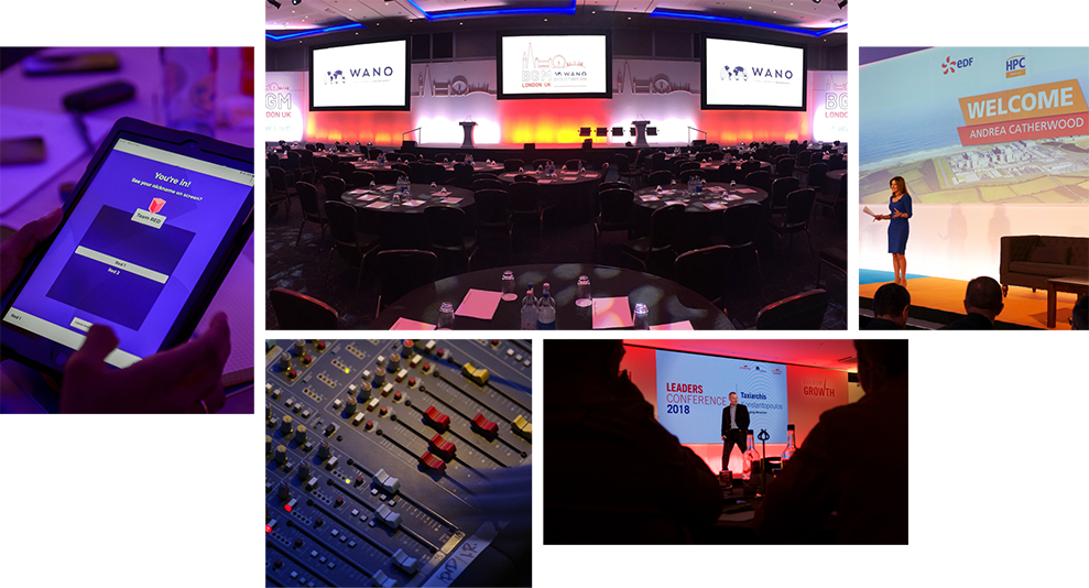
Let’s be honest, events can be complex beasts. From venue negotiations and safety protocols to that one specific lighting fixture you absolutely must have, there’s a lot to juggle.
…which is industry speak for: “A logistical nightmare that keeps you awake at 3 am.”
But not on our watch. Your dedicated project manager becomes your event ally, handling everything from initial concept to final teardown. That includes everything else that comes with it: nailing down the perfect theme, developing your comms strategy, producing your event collateral—you name it, they take care of it.
They know your vision inside and out, anticipate your needs before you even voice them and, most importantly, they’re just one call away.* Always.
*Just, please, don’t call at 3 am. We need our beauty sleep…
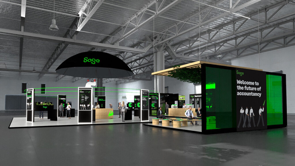
Remember when you had to explain your vision using hand gestures and hope for the best? Well, those days are gone. Our 3D wizardry, flythrough animations and AI-assisted toolkit mean we can bring your event experience to life before a single piece of equipment arrives on site.
It’s not just pretty pictures; it’s practical magic.
Spot issues, make tweaks and perfect your vision, all before spending a penny on setup. We’ll show you exactly what to expect, so there are no on-the-day surprises. And, what’s more, we’re fully maximising AI’s potential to make your stands and visuals better, quicker and cheaper. Just look at what our Joint MD had to say.
Great events need great content, but who has time to coordinate designers, animators and tech teams while managing everything else?
Psst… the answer’s us. We do.
The team orchestrates everything from creating template files to lay solid foundations, through to handling formatting inconsistencies and last-minute changes, making sure that your content performs flawlessly when the spotlight hits.
Our producers rehearse transitions, test every video and create backup plans for your backup plans. Because in live events, “it should work” just isn’t good enough.
Events aren’t just about what happens on the day—they’re about the story you tell before, during and after.
This is where our Creative team really shines. We take the time to understand your objectives, your audience and what makes them tick. Then, we craft messaging that connects. Sometimes it’s a surprising statistic that changes perspective; other times it’s a personal story that tugs at heartstrings. Often, it’s an interactive element that turns passive listeners into active participants.
Whatever approach we take, the result is the same: an unforgettable message that stays with your audience long after the event ends.
The world has changed and so have events. Whether you’re going fully virtual or creating a hybrid experience, we’ve got you covered.
We’ve all been to virtual events where technical issues, poor production values or clunky interfaces created more barriers than bridges. We do things differently. Our technical know-how makes remote attendees feel like they’re in the front row.
But technology is just the beginning. We also reimagine how content is delivered for digital audiences, incorporating interactive elements, shorter segments and engagement tools that keep remote attendees just as invested as those in the room.
So, there you go. Our comprehensive, collaborative and remarkably easy approach to events. Got one on the horizon? Drop us a line and let’s chat about how we can make your next event the easiest—and most impactful—you’ve ever produced.
Introducing INSIDE/OUT: a new series offering a unique peek inside Outlook Creative’s extensive capabilities. In a nutshell, it’s all the ways we deliver on our brand promise to make a measurable difference for you.
You won’t find much fancy agency talk here—just pure skills and passion.
We believe design is everywhere. That’s why episode 3 of INSIDE/OUT drops you right into our Design team’s world.
No fluff. No guff. Just a dedicated team of designers making magic happen.
Enjoy the show—and keep an eye out for more episodes coming your way soon. 👀
Want to find out how our designers can sprinkle come magic on your next project? Reach out.
Written by Andy Upton, Art Director
Recently, I had the incredible opportunity to visit Forward Festival Vienna, the final stop in their four-city tour across some of Europe’s most inspiring creative hubs.
This two-day event, held in the historic Gartenbaukino—Vienna’s oldest cinema—was a masterclass in innovation and artistry, featuring over 20 world-class creatives sharing insights, techniques, and jaw-dropping projects in design, animation, and film.
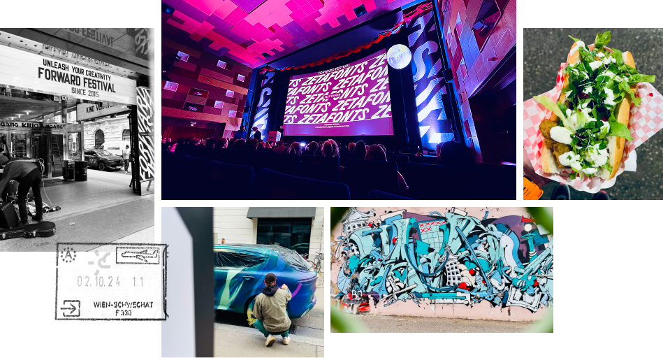
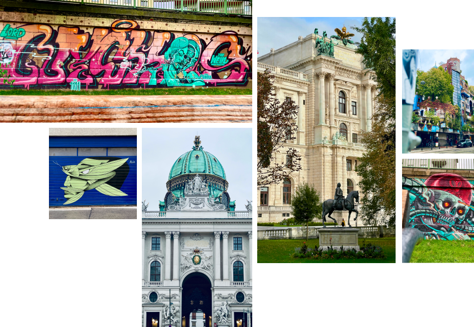
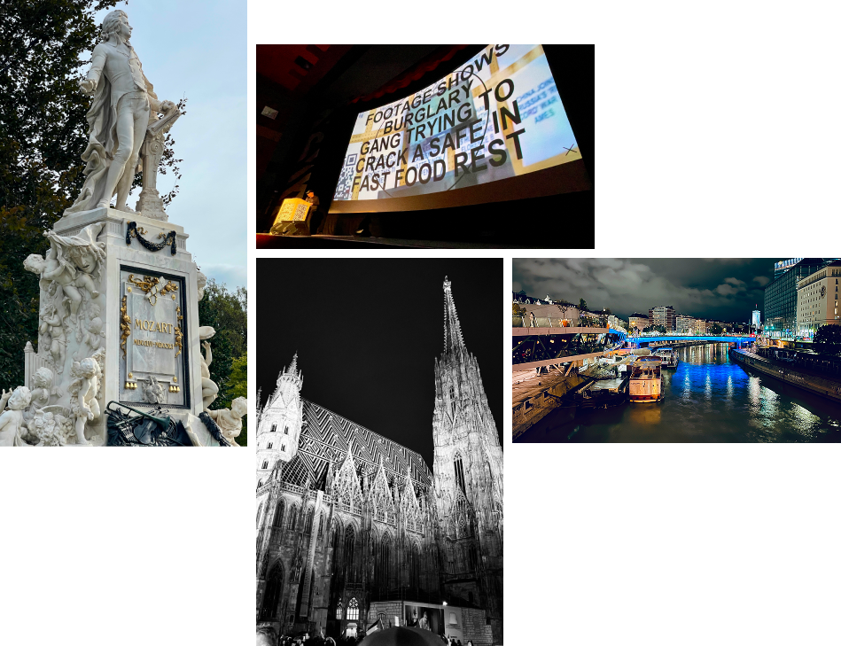
Vienna is a city that breathes art and history in equal measure. From the vibrant graffiti along the Danube Canal to the majestic palaces, cathedrals, and monuments scattered across the city, it’s a stunning blend of classical elegance and modern urban grit. I was lucky to have some time before the festival to explore, soaking in the visual feast the city offers. Everywhere you look, there’s inspiration—whether it’s the intricate details of Baroque architecture or the bold, expressive street art.
The speaker lineup was packed with talent, but a few stood out for me:
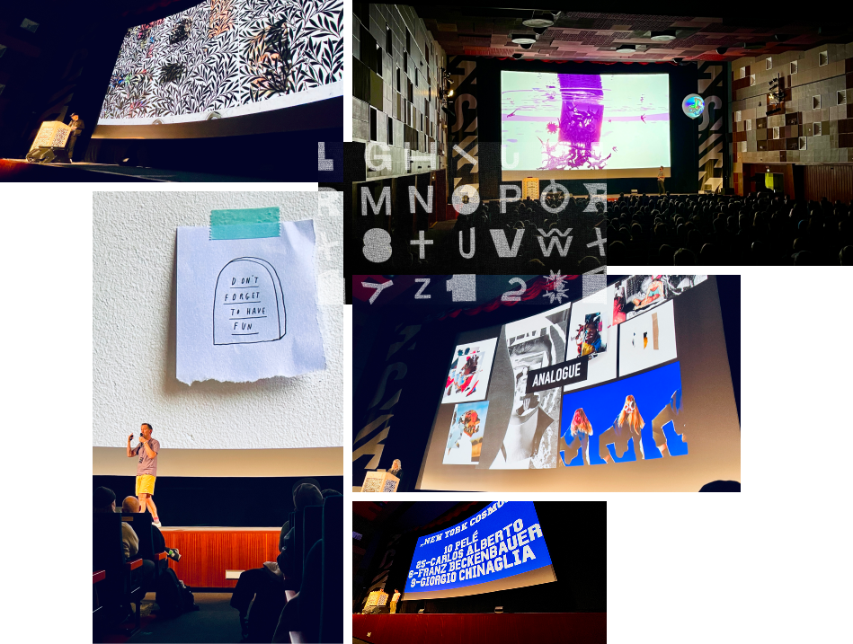
If there was one recurring theme throughout the conference, it was playfulness. Every speaker touched on the importance of embracing a playful mindset—not just as a means of crafting standout work but also as a way to make the creative process itself more enjoyable. Whether it’s experimenting with wild ideas or pushing boundaries, it’s clear that a sense of fun can be the secret ingredient to success.
Forward Festival Vienna wasn’t just an event; it was a celebration of creativity and a reminder to approach our work—and our lives—with curiosity, courage, and a little bit of mischief. Vienna’s charm and the festival’s energy left me inspired and ready to infuse more playfulness into my own projects.
Forward Festival Vienna got you inspired? Let’s bring bold creativity to your next project. Get in touch to see how we can collaborate.