
Regulatory reports have a difficult job.
They need to distil months, or sometimes years, of work into a clear and compelling case for what’s been achieved and why it matters. Throw in a strict page limit and an immovable deadline, and that’s no mean feat.
There’s a lot to fit in, and very little room for anything to get lost. This is where good design becomes the difference-maker. It gives readers a clear route through the evidence, helps them understand its significance and gives them the tools to see how everything fits together. In a nutshell: an intrinsic part of how the document does its job.
But good regulatory reporting isn’t just about what appears on the page. From understanding your audience to harnessing the power of true collaboration, here are five things we’ve learnt from many years of delivering complex regulatory reports.
1. Start with what the reader needs
Who will use the report, and what do they need from it? Are they comparing performance, tracking an outcome back to a decision or checking the evidence behind a claim? Each task asks something different of the design.
The stakes are often high, so the document has to be useful to the person reading it. That’s why we work closely with you from the start to fully iron out what your audience needs to find, understand and remember before getting stuck into the visuals.
It’s a symbiotic process. You bring the knowledge of the subject and the people you’re speaking to; we bring the visual communication know-how. Together, they’re the linchpin of the creative process.
2. Get to know the parameters
Purposeful design also means understanding the conditions the report has to work within.
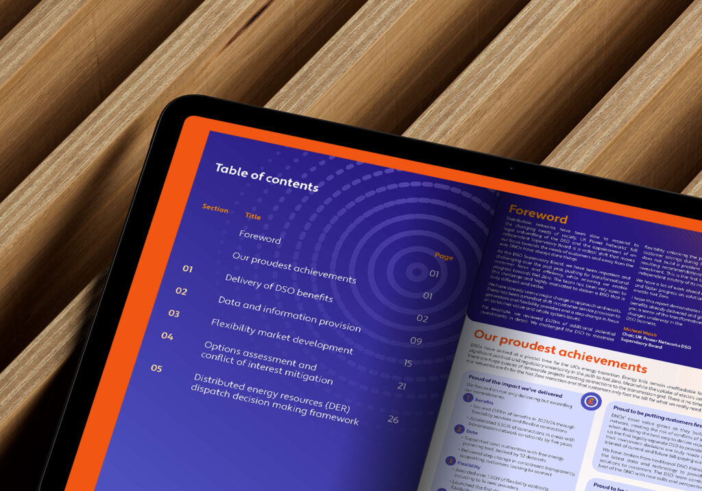
Take our work for an energy sector client: a complex annual submission with a strict 30-page limit and a fast-moving production process.
That raises some important questions. What deserves space on the page? What could be communicated more clearly in a different way? Understanding the parameters early helps us answer those questions with the client. It also allows us to create a design system that makes the best use of the available space and stays consistent as the content develops.
3. Design with purpose
Once those parameters are in place, our design decisions have something concrete to bolster them.
Point 1 means we know what the report’s readers will be looking for. This stage is about making sure they don’t have to hunt to find it. Few things frustrate a reader more than having to unpick how a chart connects to an explanation three pages later.
Colour can help a reader follow related sections. An infographic can show how several activities contribute to an outcome. Visual hierarchy can make the main finding clear while keeping the supporting detail accessible.
The aim isn’t to reduce the substance of the information. Instead, it’s about giving readers everything they need to navigate and digest what’s there, so they can understand why it matters.
4. Be ready to respond
Complex reports rarely move in a straight line from initial copy to finished design. Feedback comes from different reviewers at different stages, content continues to develop and sometimes all of that happens very close to the deadline.
A focused team and an established way of working make it easier to respond quickly without losing sight of the bigger picture. As is often the way, one ostensibly simple amend can affect the structure of a whole section.
Our close working relationship with the client team means we understand the report, its parameters and the thinking behind it. That helps us react to revisions in real time while maintaining consistency across the submission.
5. Build partnerships that last
Last but certainly not least, we come to partnership: the oil that keeps the machine running smoothly.
The more closely client and creative teams work together, the more shared understanding there is to build on. For example, feedback from previous submissions informs our design approach for the next, and each reporting cycle offers another opportunity to consider how the evidence could be presented even more effectively.
—
So there you have it. Designing to be understood isn’t necessarily about removing complexity. More often than not, it’s about giving the right people a clear way through it, so they can see the full value of the work.
Planning your next complex regulatory report? Get in touch and tell us what your readers need to understand. We’d love to help make it clear.
 Related thoughts

