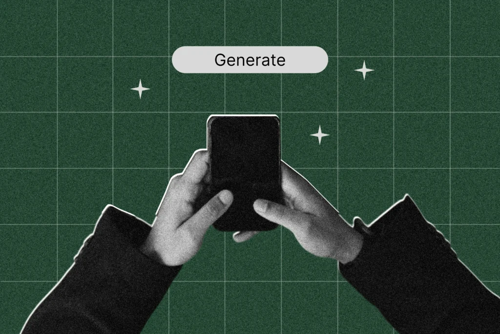
There’s no questioning that AI has thrown a big old stick of dynamite right in the midst of the way work is created. For editorial teams, the subsequent content explosion has brought with it a lot of questions and, if we’re honest, a hearty side helping of existential angst.
It’s transformed workflows irrevocably, which isn’t surprising in industries where time is a currency and AI platforms can churn out thousands of words quicker than you can open a thesaurus.
But the thing about the word ‘transformation’ is that it’s neither inherently positive nor negative. At its core, it means a dynamic, fundamental change—which is definitely true. But with change comes—and this is a key word—nuance. Ironically, that’s something AI-generated copy tends to remove.
So here are some thoughts on the AI copy debate. Except instead of talking in statements, we’ve done our best to inject some nuance back into things. Because like most things in life, there are good bits and there are less-good bits. The key is staying informed and using your own (human) judgement to use the better bits to your project’s advantage.
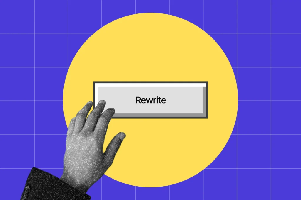
AI can accelerate editorial workflows, but not always
It’s true that AI often speeds things up. (Yes, we’re aware that’s a statement, but hey, there’s that nuance for you.) In doing so, it’s also helped lower barriers to creating written content. But it doesn’t necessarily follow that it’s lowered the barriers to creating good written content.
That’s partly because good writing has never been about words alone. For a piece to truly speak to its reader, the experience has to feel seamless. There’s a compelling flow that takes you from one thought to the next in a way that feels intentional. And the way those thoughts are expressed—voice, tone and language—feels clear and authentic. You finish having digested a cohesive point that’s been delivered in an interesting way, whether you agree with what’s been posited or not.
Now, AI is undoubtedly helpful for some of that stuff. When you’re struck with a case of writer’s block, or are struggling to unpick a complex idea, it’s great for giving you a framework for your thinking and streamlining that brainstorming process.
Where it falls down, however, is when you ask it to generate the piece from scratch. More often than not, you’ll find the finished product circular in argument, peppered with dubious-sounding claims and written in a way that feels weirdly familiar. As the ultimate people pleaser, it tells you what you want to hear, not the objective truths that make your writing better.
As a result, it’s not uncommon to find yourself spending just as much time editing a piece to make it feel ‘human’—and fact-checking that those claims are actually legit—than if you’d just written it yourself in the first place. Which brings us on to our next point.
Navigating the sea of sameness
Noticed how everything’s starting to sound weirdly familiar? Us too. We’ve all got stuck into the em dash debate and found ourselves noticing the repetitive use of certain buzzwords and sentence structures. (We’re talking about you, rule of three; and you, ‘It’s not X, it’s Y.’ We’ve also never been asked to ‘dive’ into anything quite so much… call us Tom Daley.)
Jokes aside, it’s no coincidence that there’s been a marked homogenisation of the tone and style of vast swathes of the comms we consume in recent years. It’s also a bit of a Catch-22: as more AI-generated content gets published, the more we ingest—and the more we subconsciously begin to emulate its style and turns of phrase. It’s not just that we’re using more AI, it’s that we’re starting to imitate the imitator. See what we did there.
That’s why one thing in particular has become more important than ever: sounding like an actual human being with a tangible personality who knows the people they’re speaking to.
Authenticity as the gold standard
What hasn’t changed is that people generally still don’t like to be marketed to. People are also developing a distinct aversion to copy that’s obviously AI-generated—something often referred to as ‘AI slop fatigue’.
We see it as a relationship thing. Like all good partnerships, the bond between brand and customer is built on trust. So why should your customers trust what you’re saying if it’s clear you haven’t taken the time to make sure it’s something that actually speaks to them?
As humans, we have something AI doesn’t, and that’s direct experience of living in the real world. As marketers, those human, real-world conversations with our customers translate to insights—language, humour, nuance—that allow us to resonate with the specificpeople we’re talking to. AI struggles to do that.
When used at its most effective, AI is an eager-to-please assistant. And there’s no shame in letting it help you, even if it makes a rubbish cup of tea. But when you let it take over completely, the quality of your message suffers because the personality gets stripped right out. That’s a surefire way to make sure your message blends in with every other that’s been generated in the same way.
Looking to the future
Change is the only constant, and AI isn’t going anywhere. Not that we’d necessarily want it to; when used in the right way, it’s genuinely helpful.
But for an editorial project to be successful, its team need to know how to work with it. It’s a partnership, but not an equally weighted one—the fact remains that no algorithm can fully replace the intricacies and peculiarities of the human mind.
Ultimately, publishing AI-generated content without proper editorial oversight is like trusting a toddler to decorate your house. Unlikely to end well, and you’ll be the one left staring at the consequences.
And there’s an analogy no AI platform could come up with.
If you’re weighing up a new agency, the thing worth buying isn’t a project. It’s a relationship that gets better the longer it runs.
In the early days, a lot of any partnership goes on context rather than the work itself. That’s unavoidable at the start. But it should shrink fast. As understanding builds, less of the conversation goes on catching up and more of it goes on what’s next. The warm-ups get shorter and the thinking starts further along. Briefs that used to need a full background session can begin halfway down the page.
That’s what compounding looks like in practice.
The part most agencies don’t reach
Plenty of agencies can deliver one great project. And sometimes, that may be all you need. But far fewer are still doing top-level work for the same clients year in, year out.
That’s the harder thing, and it doesn’t happen by default. It takes both sides staying invested, still pushing each other, still expecting more next time than last. Consistency only counts when it doesn’t slide into complacency. Stay with a partner long enough and the risk isn’t that the work gets worse, it’s that it gets comfortable. The relationships that keep paying off are the ones where nobody lets that happen.
What we mean when we say we stick around
We’re not pointing to that to boast about the number. We’re pointing to it because of what it takes to get there. Two decades of still being useful, still being challenged, still earning the next brief. You don’t last that long by coasting, and you don’t last that long if the work stops being good.
So when we say we stick around, that’s the proof. Not a line in a pitch, but a track record of being the kind of partner worth keeping. And we only get to stay that long because we keep earning it.
A different way to look at it
A fresh start has its place. Sometimes it’s exactly what a piece of work needs, and bringing in someone new is the right call. The question worth asking is whether the agency you choose is built to become a partner who already gets it, or just another supplier you’ll be briefing from scratch in a year’s time.
We’d back the first kind. Because twenty years in, the value isn’t in any single project.
It’s in everything you no longer have to go back over again…
and again… and again.
Great creative rarely begins with a great idea. It begins with a better question.
At Outlook Creative, we’ve never believed that inspiration is the hard part. Discipline is. Knowing when creative can do the heavy lifting versus when it just sounds good in a friendly room. Knowing when to push further and when to stop tinkering. Knowing the difference between interesting and right. Strategy and rationale aren’t just as important as the creative—they’re critical elements, baked into everything we do.
Here’s how we get there.
1. Diagnose before you prescribe
We start by interrogating the brief, not executing it. What’s the real problem underneath the stated one? Who and what needs to be moved and from where to where? The obvious answer usually has a better one hiding just behind it. Great creative finds exceptional solutions, so you’d better ask the right questions up front.
2. Discover what’s actually interesting
Every project has a detail, a tension or an angle that makes the whole thing suddenly click. It’s rarely on page one of the brief. Our job is to find it, recognise it for what it is and resist the temptation to sand off its edges to make it feel safer.
3. Pressure-test. Repeat
We don’t fall in love with concepts too early. We push them, argue with them and ask the questions that might break them. The ideas that survive aren’t just clever. They’re durable. And they have an outcome that can be measured.
4. Build the system, tell the whole story
A great idea has to work everywhere: not just in the showpiece execution, but in every format, channel and context it will actually live in. We design creative that holds together as a system, consistent enough to be recognisable and flexible enough to travel.
5. Craft it until it earns attention
Execution is where most ideas are won or lost. The right word over the almost-right word. The visual that clarifies rather than decorates. The detail that makes someone stop and look twice. This is where rigour and imagination have to occupy the same space, and where we do our best work.
6. Ship it. Stay with it. Measure it.
Making it isn’t finishing it. We stay with the work from delivery and care what happens after it lands. Did it move the right people? Did it do the job? Do we need to adjust? Great creative isn’t just made well—it’s followed through on.
In the end, a creative process only matters if it changes something. Whether that’s what people understand, what they feel or what they do next. That’s why discipline sits at the centre of everything we make. It’s how we turn ambition into structure or ideas into systems and, finally, execution into impact.
At Outlook Creative, we’re not interested in work that simply looks finished; we’re interested in work that performs in the real world and holds its shape under pressure. We want work to earn its place every single time it’s seen. Because great creative isn’t defined at the point of launch, but in everything it goes on to change afterwards.
Congrats to Carl on his promotion to Senior Motion Graphics Editor. A well-deserved and unsurprising promotion.
Since joining the Moving Image team, he’s brought creativity, energy and a genuine desire to push things further. Whether it’s exploring new approaches or challenging the team to think differently, Carl has a way of making the work (and the people around him) better.
As Adam Sherlock, Joint MD, put it, Carl ‘brings a huge amount of positive energy to the team, always looking for better ways of doing things’. His line manager Shauna Swift echoed that, highlighting his infectious team spirit and the growing impact he’s having both on projects and across the wider team.
This promotion reflects everything he’s already bringing to the table. A well deserved step up, and one the whole team is behind.
Carl brings a huge amount of positive energy to the team, always looking for better ways of doing things and pushing us to think differently. His willingness to explore new approaches and push creative ideas has made a real impact. A very well-deserved promotion.”
Adam Sherlock, Joint Managing Director
“From day one, Carl has brought creativity, passion and an infectious team spirit to his work. This promotion reflects his growing skillset and the positive impact he has both on projects and across the team. We’re excited to see him push things forward. Congratulations Carl—well deserved.”
Shauna Swift, Senior Production Manager – Moving Image
How testimonials build trust in a way that doesn’t feel like marketing
In complex sectors like healthcare and medtech, trust is hard-earned—and rightfully so. One of the biggest challenges is getting people to believe in something they may not yet fully understand or have never experienced themselves.
Yes, you can explain product benefits, outline a service and present the data, but none of that really gets to the core of what people want to know: what difference will this actually make to my life?
Whether it’s a patient considering a potentially life-changing therapy or a clinician evaluating the latest innovation, there’s often a gap between information and belief. What’s missing is that uniquely human story—the relatable moment where someone can say, ‘Because of X, I can now do Y, and my life is significantly better because of it.’
Closing that gap is where the most effective marketing happens.
Why testimonials are the ultimate connector
Now, this isn’t the first time we’ve spoken about human-to-human (H2H) marketing. And there’s a reason for that. Experience has shown us that testimonial storytelling occupies that space between information and belief with a specific kind of power.
The most impactful work feels personal, not promotional. Crucially, it doesn’t feel like marketing at all. That’s why authentic stories can do something most messaging can’t: translating complexity into lived experience. They show impact, rather than simply describing it.
And the same goes across the board, whatever the audience demographic or subject matter—as these projects highlight.
‘Ordinary’ people doing extraordinary things
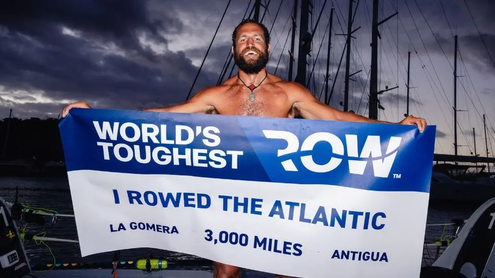
In 2023, Elliot Awin became the first person with a pacemaker to row solo and unsupported across the Atlantic Ocean.
We met Elliot as part of a project for a leading healthcare client to help share the story of how his own experience of living with heart arrhythmia has inspired him to support others.
Hearing Elliot telling his own story, in his own words, made all the difference. It’s the kind of story that doesn’t just inform but shifts perception in ways that a brochure or product booklet never could.
Stories that transcend language
In other instances, the challenge isn’t just building trust, but doing it across languages, cultures and markets.
On a recent European campaign, we captured a patient’s personal experience of living with pelvic health issues, and how a tiny device had changed her life.
The interview was conducted in her native Portuguese, which meant taking a slightly different approach—especially when it came to editing a story we couldn’t fully understand ourselves.
Working closely with our Portuguese crew for translation and context, we were still able to craft a heartfelt film that captured both our interviewee’s courage and the transformative impact of her treatment.
Proof that when a story is authentic, it transcends language.
Not just for patients
And it’s not just patient testimonials that pack a powerful punch. Clinician stories can be just as impactful, especially when you’re speaking to other clinicians.
For example, we recently delivered a project where our objective was to capture healthcare professionals (HCPs) sharing their experiences of using cardiac devices in real clinical settings.
There were no scripts and no over-polishing, just people talking about what works, how it enhances their day-to-day practice and why it supports better patient care.
That’s what gave it weight. Because when insight comes from peers, it carries a level of credibility that traditional messaging simply can’t match.
More than marketing
Testimonial marketing is often described as “the strategic use of positive feedback to build trust and increase sales.” But that feels like it’s missing the point a bit. Actually, a lot.
At its best, it’s about helping people actually understand something by showing what it looks like in real life—the tangible impact that we’d otherwise struggle to grasp.
Through human experience, abstract benefits suddenly feel relatable, technical features start to make more sense, and a message becomes something you genuinely believe.
And that’s why, in a world saturated with content, human stories will always cut through.
A presentation coach I once spoke to told me about two clients he saw in the same week. One arrived having memorised a 16-minute speech and the other came in with a handful of clear points and the confidence to speak around them.
By the end of the session, there was a clear difference. One was focused on getting through it. The other was focused on the room (and the people that matter). Can you guess which was which?
Of course you can.
That’s exactly the difference most PowerPoints miss. They’re built to support the speaker, not the audience.
By the time a deck lands on your desk to “tidy up”, it’s already been built the same way. It’s never that the slides look bad, it’s that the deck is trying to do six jobs at once—inform, reassure, document, prompt, cover the speaker’s nerves and survive multiple rounds of feedback—and somewhere along the way it stopped being a presentation.
Earlier in my career as an events designer, I was the guy on site the night before, working alongside clients and speakers that knew something wasn’t right but couldn’t name it. In those situations you learn fast that what’s needed isn’t a tidy-up. It’s a rethink.
The slides are doing the speaker’s job
Most speakers use PowerPoint as a safety net, which is understandable. Nobody (and I mean nobody) wants to forget a key point in front of senior stakeholders. But once that happens, the slides become the script. Every reassurance the speaker needs is now sitting on screen in nine-point font, asking the audience to squint and listen at the same time.
As a marcomms professional, you’re being given a deck built for one person’s confidence and being asked to make it work for a whole room. Usually without enough time, alongside everything else. The deck is one job among twenty, and it’s the one that’s most visible if it goes wrong.
So the task is to work out what belongs on the slides and what belongs in the speaker’s mouth.
Words do more work than slides
It’s easy to assume good presentation design is about making slides look pretty. It isn’t.
Copy carries more weight than it gets credit for—as our creative copywriter and proofreader reviewing this article will no doubt agree (hi Becky and Josie). The strongest decks have clear, purposeful statements running through them. Not headings that label a topic, but lines that tell the audience the point straight away. A strong opening statement can frame a slide in seconds, which means people aren’t picking through the detail trying to work out what matters.
That’s where the real improvements start. Not making everything shorter for the sake of it, but being more deliberate. Say the right thing clearly and give the audience a way in.
The same goes for imagery. Used well, it sharpens a message or sets the pace. Used badly, it becomes filler.
Complex doesn’t have to mean cluttered
You’ll get pushback on this, especially in regulated sectors—”it needs to all be there”. And often, it does.
A lot of the decks crossing your desk are complex for good reason: real data, detailed graphs and technical nuance that really matters. In healthcare, medtech and similar spaces, that detail is often the point.
The work is in how you shape it:
That’s a better conversation to have with stakeholders than “we need to make it look better”. It’s also often easier and more cost-effective. Win-win.
The decks that work are collaborative
The presentations that get it right are almost always the ones built together. Not the ones tidied up at the last minute, but the ones where there’s space for a real conversation.
If you’re the person managing this from the comms side, that conversation is yours to push for. The speakers who lean into it get more out of the process. And so do their audiences.
Once that’s sorted, designers can work their magic and creatives can carve the copy so the deck comes to life and nothing gets missed.
With that in place, the audience will remember what you said.
Which is the whole point of doing this in the first place.
Reading this and thinking “I need someone who can actually do all of this”? Good news, you’ve found them. Get in touch.
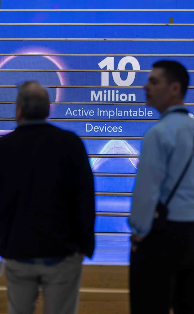
For twenty years, a global medtech leader has trusted us with their highest-profile events.
So when they approached us to help launch their 2026 milestone celebrations, we knew that it would be a standout project. The year marks three major milestones, each representing decades of innovation, growth and impact in healthcare:
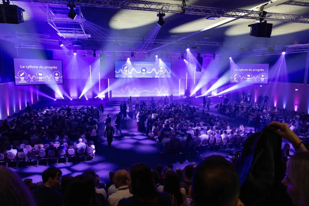
To bring those moments together, we looked to create an identity for a two-day celebration involving more than 800 employees alongside senior and executive leadership. The original brief sounded simple: one visual for one event. But as we explored the project, it became clear that this was something far bigger. A milestone year that demanded an identity capable of carrying the story.
Finding the pulse
These anniversaries were about more than numbers. They needed to resonate with the people behind them. They were a powerful reminder that lives have been changed and clinicians and caregivers have been supported, all made possible by their employees’ hard work and innovation to shape the future of healthcare.
So with the stakes this high, the creative process had to start with the right question: what does this moment actually represent?
We came up with the idea: the Pulse of Progress.
A pulse is a simple but powerful signal of life, capturing movement and momentum. And progress, whether in healthcare, technology or patient outcomes, is rarely linear. The concept felt right immediately.
Collaborative creative
To bring it to life visually, the team developed a distinctive ‘wave’ identity. This took the form of a rhythmic pulse that could move across various formats, screens and spaces. This visual language that felt both dynamic and meaningful, as well as connected the client’s role at the heart of healthcare.
Projects like this only work when different disciplines work in harmony: creative direction, art direction, design, copywriting and moving image all came together holistically, ensuring every piece of the campaign told the same story.
Bringing the story to life
Once the identity was established, the campaign quickly expanded across multiple formats. The team designed and produced a wide range of materials, including presentations, event branding, environmental graphics and video content.
In the weeks leading up to the celebrations, our video team spent multiple filming days capturing additional content to support the narrative. One of the most powerful moments came in Bern, where our crew documented the implantation of a landmark implantable device at one of the country’s leading hospitals. A milestone that brought the scale of the achievement into sharp focus.
The two-day event itself marked just the beginning. Even weeks after the launch, internal teams continued to reference the work, and external audiences noticed its reach. Short-form social edits, long-form storytelling and internal communications all carried the Pulse of Progress identity forward. With more than 100 creative assets produced, including over 25 video outputs spanning internal and external channels, the campaign wasn’t just visually consistent, but genuinely connecting with people in a meaningful way.
“From concept to execution, the team delivered an identity that was as meaningful as it was scalable. Pulse of Progress united multiple milestones under a single, powerful story, carrying our message seamlessly across events, content and channels. It didn’t just celebrate our history; it brought our people together, reinforced the real impact our work has on lives, and became a shared language for what we’ve achieved and where we’re going.”
– Sr. Director, International Brand, Digital & Corporate Marketing
A partnership built over time
There’s another reason this project feels particularly special for us. 2026 also marks 20 years of collaboration between Outlook Creative and our client.
As our Co-Managing Director, John Lloyd puts it:
‘In the 12 and a half years I’ve personally worked with this client, we’ve delivered thousands of projects together. But this one stands out as one of the highest-profile pieces of work we’ve ever done. The level of content and engagement that came out of this project was incredible.’
Moments like this, where creativity, trust and shared purpose all come together, remind us why long-term partnerships matter. There’s real value in working with people who understand the story you’re trying to tell. And for this incredible milestone year, that story is only just getting started.
Every piece of work has a story behind it. Not just what was made, but how and why it came to be. So we asked our Creative Director, Pete Michels, to share a different kind of perspective—one that steps back from the finished work and into the thinking behind it, offering an insightful glimpse behind the curtain of creativity.
Recently we tried something a little different.
Nothing revolutionary—pretty simple actually. But after going through it, I don’t think we can live without it.
Creative work has a beautifully strange rhythm. You spend an inconsistent amount of time thinking about something. Exploring it. Questioning it. Pushing it forward. Questioning it again.
Then eventually you commit.
And eventually you let it go.
One day it’s ‘finished’. The files are sent. The project moves on. And the work begins to take on a life of its own.
(They grow up so fast.)
And like most things we release into the world, we rarely sit down with it again.
Most designers don’t get the chance to stop and talk about the work once it’s done. Of course there are conversations during the process. Rationales. Check-ins. Presentations.
But that’s still the process.
What’s often missing is the story after the work has been set free.
The hesitations.
The instincts.
The micro-decisions that quietly changed everything.
So, we asked the designers to bring the work back.
Client work. Personal work. The things they’re proud of. Sometimes the things they’re still figuring out.
And then we sit down and talk. Just three of us.
Over the past few weeks each designer has been sitting down with Andy, our therapeutically calm Art Director, and myself (nothing therapeutic about me) to share what we’ve been calling a ‘personal lookbook’.
It’s not a presentation.
It’s not a critique session.
When it works well, it’s closer to a one-sided conversation.
This is their time to talk about the work. We mostly listen. Occasionally scribble something down. Andy radiates a calming presence.
Creative wellness at its finest.
Designers bring together projects and personal work they’re proud of, and sometimes work they’re still processing.
And they talk.
The thinking behind it.
The decisions that shaped it.
The instincts that pushed it one direction instead of another.
They’re using a muscle that, for many designers, doesn’t get exercised often enough.
The muscle of explaining how their creative mind actually works.
These sessions are intentionally small. Just three people in the room.
That intimacy matters.
Sometimes the conversations get unexpectedly personal.
Because creativity, whether we admit it or not, is something we all take a little personally.
Finished design can feel inevitable.
Once something exists in the world, it looks like it was always meant to be that way.
But anyone who has made something knows the truth is usually much messier.
There are moments of uncertainty.
Ideas that almost worked.
Decisions made on instinct, skill, taste and confidence.
Details that need unpacking. Debate. Occasionally, a high-five.
The lookbook sessions open the doors on all of this.
And what emerges isn’t just a collection of projects.
It’s something much more interesting.
A map of how a creative brain works.
Something interesting happens when designers talk about their work like this.
They start by sharing what they’re proud of. The projects that meant something to them. The ideas that pushed a little further. The details that quietly hold everything together.
And often it’s not the projects you’d expect.
But as the conversation unfolds, something shifts.
Not toward critique. Toward understanding.
Why this idea felt right.
Why that decision mattered.
Why certain instincts led the work in a particular direction.
What emerges isn’t a defence of the work.
It’s clarity.
Because real creative confidence doesn’t come from believing you’re always right.
It comes from understanding why you made the decisions you did, and being able to stand behind them.
Here’s the part we didn’t fully anticipate.
Andy and I learn just as much in these sessions as the designers do.
Sometimes we discover strengths we hadn’t fully seen yet.
An interest we haven’t tapped into.
An instinct that deserves more room.
A perspective we should be leaning into far more often.
You start to realise that reviewing the work isn’t really the point.
Understanding the person behind the work is.
These conversations help us see not just what someone has made, but the kind of designer they’re becoming.
Design, after all, is a profession built on judgement.
And judgement only develops through experience, reflection and conversation.
(take a few of them, actually)
In an industry that moves quickly, taking time to step back and talk about the work can feel almost radical.
There’s always another brief.
Another deadline.
Another project waiting to begin.
But pausing to reflect, even briefly, reminds us that creative growth doesn’t just happen through making more work.
Sometimes it happens through understanding the work we’ve already made.
Because the fastest way to grow as a designer is to understand how you already think.
And occasionally, through laughing at the decisions we thought were brilliant at the time.
Great studios talk about the work.
Great designers talk about why the work exists at all.
The lookbook sessions are quiet conversations.
No presentations.
No audience.
No performance.
Just designers reflecting on the work that matters to them, and the thinking behind it.
And in those conversations, something important becomes visible.
Not just what someone has made.
But the designer they’re becoming.
And, hopefully, the studio we’re becoming together.
When an Executive Leadership team event stretches across three days, dozens of sessions and hundreds of touchpoints, the challenge isn’t necessarily volume. It’s coherence. You need everything to belong in the same world, especially when timelines are tight, expectations are high and most of the audience were there last year.
From the outside, this kind of project can look effortless: cinematic, confident and clean. Up close, however, it’s layered and deeply human. Which basically means a small group of very skilled people holding a lot of moving parts at once.
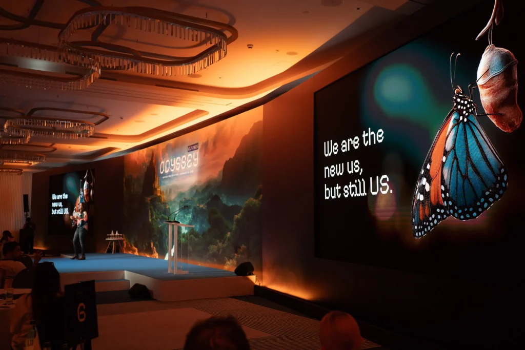
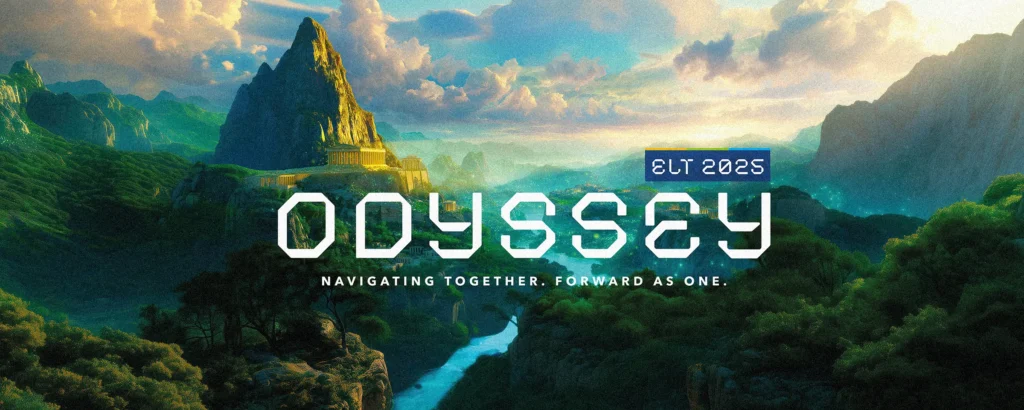
We saw this first-hand on a recent Odyssey-themed Executive Leadership event for a long-standing client of ours. This time, that coherence came from two inseparable forces: a strong, enabling theme, and the way we used AI to expand creative exploration and build at scale.
Granted, AI didn’t make Odyssey happen overnight, but it helped us explore faster, go further and keep the whole three-day experience feeling like one joined-up world.
Turning scale into story
The brief was to deliver a consistent experience across three days that felt intentional, connected and genuinely different for a returning audience. Less your typical conference, more stepping into another world.
Sure enough, world building emerged as a defining idea. Design soon moved beyond individual assets and began to imagine a complete, coherent world that unfolded over the three days. AI stepped up as a creative tool to support that narrative and scale.
That concept then evolved into a journey, or Odyssey, spanning three distinct environments. Early visual thinking drew loosely from fantasy world maps (think Lord of the Rings), where colour, terrain and geography signal progression. It established spatial storytelling from the start and clarified the three stages, helping the audience instinctively understand where they were in the story without over-explaining.

AI as a sketchbook, craft as the finish
When it came to mapping the narrative and distinct environments for each day, generative image exploration became our sketchbook. What started as vast landscapes, dramatic light and architecture emerging from rock progressed into a metaphorical acropolis for day one, dense green mountains for day two and an open water horizon for day three.
This is the bit that can sound magical when you summarise it. In reality, it’s iterative. You explore, refine, test… and then go again. Small prompts don’t always translate to small changes, so creative judgement is a must every step of the way.
Once we had strong direction, we shifted from exploration to build. That meant retouching, rebuilding, extending canvases, correcting light and adjusting perspective, sometimes merging multiple outputs to achieve a workable result. This is the unseen part that requires making the right call: do we regenerate or rebuild? Does that particular imperfection add character, or break the illusion?
An early stylistic decision shaped everything. Rather than aiming for photorealism, we leaned into a stylised, gamified aesthetic, closer to Avatar or a high-end video game world. That choice freed us from being hyper-real and made every design element feel intentional.

Continuity is where it counts
For Odyssey to feel truly immersive, each of our environments had to feel distinct yet undeniably part of the same universe. Otherwise, you don’t have a world; you have three separate backdrops.
The navigators were central to that consistency. As guides through the journey, they had to feel like they belonged inside it. Built as hybrids, we used real client imagery to anchor each character, while generative visuals pushed the world and wardrobe. Here, AI captured the Jumanji-esque vibe we were going for… just not the person. Turns out, ‘generic adventurer’ is easy; ‘recognisable speaker’ less so. Human design skills were very much key to rebuilding and refining each profile until the team was unmistakably themselves.
While AI supported scripting and visuals, the voiceover was intentionally human. A trusted voice actor anchored the story inside those otherworldly environments. Music was selected early with different tracks for each day, so the voiceover was recorded to music. That meant pacing and emotional rhythm were locked in from the outset.
Essentially, the tools helped us explore a bigger playground. The craft is what allowed us to piece it all together into a story with staying power.
So… does AI make it quicker and cheaper?
Onto the golden question: if you’re using AI, doesn’t that automatically mean faster and cheaper? Well, not necessarily.
On Odyssey, it became clear early on that AI wouldn’t reduce the work, but it could raise the ceiling of possibility. The real difference was how much we could build within the time we had, and how quickly we could test ambitious ideas before committing to a final route.
And that’s not to say that the process was seamless. Like any large-scale event, the journey to fruition was still intensive and iterative, with a constant need for creative judgement and control.
That’s the big win with AI. Not speed for its own sake, but what it unlocks: ideas you wouldn’t reach as quickly otherwise, and a broader creative horizon to explore. The output still depends on those talented humans you’ve always trusted making the calls.
If you’re looking for the people who can shape the work, keep it coherent at scale and bring the best ideas to life, let’s talk.
Live events are a high-pressure environment.
You’ve invested months in planning the stand, aligning the messaging, getting the team there, building something you’re proud of. Then the doors open… and suddenly everything is happening at once: overlapping conversations, competitors playing who can shout the loudest—all whilst attention is short and everything’s moving on fast forward.
And in that reality, the brands that come out on top aren’t always the ones with the biggest presence; they’re the ones that can respond in real time. Those that can capture what’s happening and share it while it’s still fresh.
The real advantage here isn’t size, it’s agility—on-site congress content that’s filmed, edited and live before the day is even done.
The problem: great stands can still get missed
Even the best exhibition experience can get swallowed up if it isn’t captured and shared as it’s actually happening.
Your team might be delivering brilliant demos, hosting meaningful discussions, running symposia… but if nobody outside that immediate moment sees it, the impact is always going to be limited.
And nope, it’s not enough to post a polished recap two weeks later. By then, the moment has passed.
Congress content needs to work both on the floor and off it. It needs to be built for speed, quality and brand control in a live setting.
Quick-turnaround content drives footfall while the event is underway
One of the biggest missed opportunities at congress is waiting too long to communicate what’s happening on your stand.
Fast, professionally edited on-site video captures activity as it unfolds, turning live moments into real-time invitations.
At EASD, for example, we created a same-day video for mylife Diabetes Care that invited delegates to experience their stand first-hand. Showcasing live demos, hands-on interaction and the energy around their evolving diabetes management solutions, it was posted while the congress was still in full swing, prompting attendees to come and see it for themselves!
Short-form video, optimised for platforms like LinkedIn, Instagram, X and TikTok, creates momentum and visibility while the event is still in motion.
Content that flexes
Live environments need modular content that can work across the event lifecycle.
That might look like:
Built as a system rather than a one-off, this approach keeps your message relevant from the first rig day to long after the stand is packed away.
Maximising the value of your exhibition investment
A congress is a serious investment, where all the different elements (not to mention the coffee!) really add up. So the question becomes: are you getting the full return?
On-site content transforms stand activity into marketing assets that continue working long after the event ends, extending the value of what you’ve already built.
Instead of one intense week of activity, you gain weeks or months of content supporting brand presence, follow-up campaigns, internal comms and future planning.
How do we know? At ESICM, we supported a global medtech leader with live congress content that brought their presence to life. Filmed and edited on-site, the videos showcased the expertise behind the brand and the diversity of the team delivering it, even engaging audiences in their native languages. Shared while the event was still underway, they extended the reach of their stand beyond the congress hall.
Built for the pace and pressure you’re under
We understand the pace organisations like yours work under. Live congress environments demand agility, consistency and creative that’s informed by what’s possible in the moment.
That’s why we create congress content designed for real-time impact—driving footfall, capturing authenticity and making your stand unmissable. Because at a congress, the brands that stand out aren’t just present. They’re impossible to ignore.